

Create data-driven ambience at conference

Look
With the growing relevance of social media and interactions that happen within its ethos, Microsoft wanted to create a bleeding edge, impactful, socially relevant obelisk that would help senior executive level attendees, who may have varying experience with social media (from zero experience or understanding to expert), realize how massive the community and conversation were.
This visual experience should create a high energy yet light hearted environment that engages the audience even from a distance. At the same time, the visualization had to convey a cohesive story which could be understood well by all the participants of the conference. The TV was 2 screens high and 6 screens wide.

To build the dashboard, pull tweets from www.twitter.com/wpc, www.twitter.com/msparter, #WPC14, #msPartner and #new2wpc
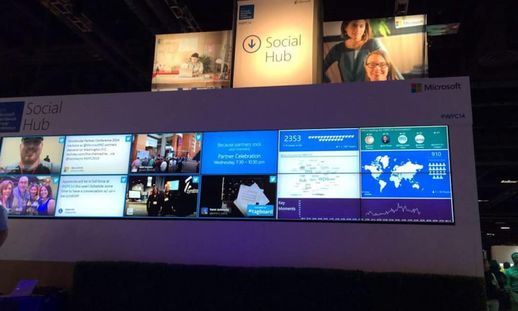
See
The visual could include following data points:
- Which countries are people who are tweeting #WPC14 or @WPC tweeting from?
- Trending topics: A word cloud showing what the trending words are for the #WPC14 conversation
- Volume of message… This would represent the WHOLE conversation: #WPC14, #msPartner, @wpc, @mspatner, #WPC2014, #new2wpc, Worldwide Partner Conference, Microsoft Partner Network
- Leaderboard: Who is tweeting the most on the #WPC14 hashtag, we think this will help drive engagement
- Certain events in the conference e.g. Keynote speech by CEO will trigger a lot of tweets. Certain events like “Talk on Microsoft and Cloud” will trigger tweets on cloud. Hence, at the bottom, we have a 5 day time-line and at any given moment of time, the actual scheduled event name is being shown. This provides context.”

To maintain a sense of continuity and real time activity, the visualization would need to refresh automatically (without page refresh) every 30 seconds
Configurations Required
- Create annotations on the timeline so audience can see which events occurred when.
- Create a blacklist of keywords and profanity so those tweets do not appear on the Social Wall
- Create a blacklist of Twitter Handles so they do not appear on the Leaderboard. This was used to ensure that Microsoft’s handles do not appear on the Leaderboard.
- Allow admin to control the sequence in which countries are shown
- Allow admin to control how many tweets = 1 image on the visual.
Act

In order to actually build and manage the Conference Dashboard, we ended up creating an enterprise caliber data ingestion engine for fetching, cleaning, modeling and analyzing raw data.
Outcome

Tweets from the events


Rumi allowed us to query Twitter API for multiple hashtags and handles and model the data every 1 minute. It also allowed us to make multiple elements of the visualisation configurable so the Microsoft team could keep the dashboard relevant as the conference progressed. Finally, Rumi was able to scale up and handle unexpected spikes in the number of tweets.