

Visualizing Election trend with reference to geography and time

Context
The period of 1975-77 is often referred to as “The Emergency”, an important historical event in India’s history. The team at IDFC Institute were trying to understand how the decision taken by the Indian National Congress (the party that formed the Central Government in 1971) affected the people of India.
More specifically, they wished to understand how the electorate across twelve (12) states in the country attempted to air their ire during the subsequent national elections in 1977.
To begin with, the team at IDFC provided us with data on the seats contested and won by the Indian National Congress across 12 states as well as the total vote share (%). These states were especially important as they collectively accounted for almost the 90% of all votes cast in the 1971 and 1977 election. Moreover, the selection of states also allowed for comparison of reaction between the Hindi speaking states and the non-Hindi speaking states.
Design Inspiration
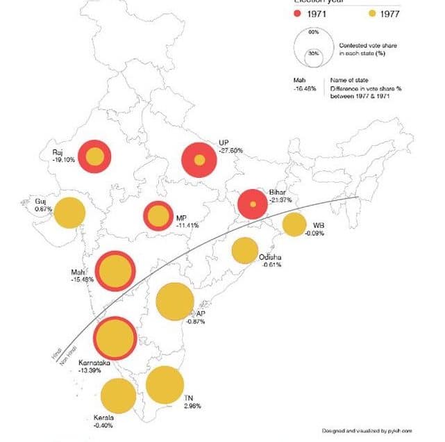
We decided to use geographic maps/outlines as a means to visualise the data for two reasons – Not only do maps provide spatial context to the data but also make comparisons across time easier to implement and read.
In order to show clear separation between the Hindi speaking states and the non-Hindi speaking states, we employed the use of an arc across the states of India. As part of this study and visualisation Hindi speaking states included Madhya Pradesh, Rajasthan, Gujarat, Maharashtra, Bihar, Uttar Pradesh, West Bengal and Odisha. On the other hand, Non-Hindi states comprised of Karnataka, Kerala, Tamil Nadu, Andhra Pradesh.

Choosing correct dataset
We started off with trying to visualise seats contested and won by the Indian National Congress across the 12 states as they provide a holistic view of INC performance. We used a circle based visual encoding for the seats data wherein the area of the circle was used to encode the number of parliamentary constituency seats contested and won by the INC.

The above visualisation quite clearly shows the change in INC performance (measured as the difference between seats won to seats contested) from 1971 to the 1977 Elections. We also included a quick reference pictograph on the top of the visualisation to show the overall seat tally for the INC for the 1971 and 1977 elections.
However, in consideration of the goal of the study, the comparison of seats won with seats contested data may not provide the full picture of how people reacted to Emergency. This is because winning or losing a parliamentary constituency fails to capture the extent by which the INC won or lost (in terms of vote differential). So we re-designed the visualisation swapping out the seats won/ contested data for the percent of votes gained by the INC candidates totaled across all parliamentary constituency for a state (the % vote share in a state). It essentially denotes the following – For every voter who cast his/ her vote, how many cast a vote for the INC?
Making this change in choice of data reduced the number of measure we would need to represent on the map. And as a result, we managed to eliminate the need for a second map of India.
Choice of color scheme
In order to represent the anger of people, we labelled regions that saw a significant drop in INC vote share between the two elections with an ‘angry fist’ icon. While this did make sense at first, it was extra ‘visual ink’. So in order to eliminate its need, we decided to choose an alternate palette to represent the vote share % and at the same time communicate the people’s anger at INC.
Traditionally, the color red is naturally associated with anger and easily grabs visual attention. However, for our purposes, anger is represented as a reduction in vote share % in the 1977 elections. So, if we used the colour red to represent vote share % in 1977, it would not create the visual perception we are looking for.
In order to create the desired visual effect, we inverted the color mapping – vote share % in 1971 elections would be shown in red and that in 1977 elections would be shown using a contrast colour (in our visualization, we chose a yellow hue). Now as a result, if the 1977 election vote share was low, the concentric circle representation would “paint in” more red. The amount of red displayed would be directly related to the magnitude of difference between the vote share % in 1971 and 1977.

Therefore, the more red the representation, the greater the fall in vote share % for that state and the greater the anger of the electorate. While using any color in an information design it is essential to account for which function it is associated with, what information it wants to convey and how color can enhance it.

Outcome
The final data infographic was published as part of an editorial by the client in IndiaSpend.com, a leading data journalism and news website.
